
The Ten-Year Yield Is the Metronome
One rate sits in the denominator of every other price. Adding 100 basis points takes 0.95% off a cash flow due next year and 24.96% off one due in thirty, and that asymmetry decides whether a decline
Quick answer: The ten-year yield is the denominator every other asset is divided by, so a move in it reprices instruments nobody was trading at the time. The arithmetic is lopsided: on a hypothetical 4% discount rate, adding 100 basis points takes 0.95% off a cash flow due next year and 24.96% off one due in thirty. That asymmetry decides which assets lead, which lag, and whether a decline arrives as a clean impulse or a two-year grind. A count built under falling yields describes a market that stops existing once the rate turns.
Most traders check the ten-year after the fact. It moved, indices fell, the two get filed as related and nothing more precise is asked. That works until you are carrying a count drawn under one set of discounting conditions and asking it to survive another.
The link is arithmetic, not sentiment. No measured yield, index level or date appears below, and the history chart carrying those measurements waits on the measured data series.
Why one number ends up inside every other price
The ten-year sits at a useful point on the curve: long enough to carry a real term premium, short enough to stay liquid at size in every session. That makes it the rate other markets reach for by default rather than by choice.
Look at who uses it without deciding to. Mortgage desks price against it. Treasurers time issuance against it. Pension funds discount liabilities against something close to it. Every valuation model has a risk-free rate in the denominator, and this is the one that gets typed in.
So it is less that the ten-year moves other assets, more that they are already quoted in terms containing it.
What 100 basis points does to a cash flow
Take a hypothetical discount rate of 4% and move it to 5%. Nothing claims that is where the yield sits. It is a round number, chosen so the arithmetic stays readable.
| Cash flow arrives in | Present value at 4% | Present value at 5% | Change |
|---|---|---|---|
| 1 year | 0.9615 | 0.9524 | -0.95% |
| 5 years | 0.8219 | 0.7835 | -4.67% |
| 10 years | 0.6756 | 0.6139 | -9.13% |
| 20 years | 0.4564 | 0.3769 | -17.42% |
| 30 years | 0.3083 | 0.2314 | -24.96% |
One dollar, one rate move, and the damage runs from a rounding error to a quarter of the value depending only on when the dollar turns up.
Put it into a shape a market trades. Two businesses, each producing 1,000 of undiscounted cash. The first pays 100 a year for ten years, the second nothing for twenty years and then 100 a year for ten. At 4% the near one is worth 811 and the far one 370. At 5% the near one loses 4.8% and the far one 21.4%. Four and a half times the damage, same 100 basis points, and nobody changed a forecast.
Perpetuities are worse. A cash flow growing at 1% for ever, discounted at 4%, is worth 33.3 times the first payment, because the spread is three points. At 5% it falls to 25.0, down 25%. From a two-point spread the same move costs 33.3%.
Duration is the word equity desks do not use
Bond desks have a term for how much a price moves per unit of rate. Equity desks mostly do not, which is why equity investors keep being surprised by what a bond trader calls routine.
Every asset has an effective duration: the weighted average distance to its cash flows. The durations below are assumptions chosen to keep the arithmetic legible.
| Exposure | Assumed duration | What 100bp takes off |
|---|---|---|
| Cash and bills | 0 years | nothing |
| High payout value equity | 10 years | 9.1% |
| A broad index | 15 years | 13.4% |
| Profitless growth equity | 30 years | 25.0% |
| Assets with no cash flow | not defined | set by opportunity cost |
The last row is the one people argue about. Gold and most of crypto produce no cash flow, so there is no present value to compress. What the rate sets instead is the price of holding them. A risk-free asset paying a real return is a competitor, and the higher that return climbs the dearer it becomes to own something that pays nothing. That channel runs through the real yield.
The path from a rate to your chart
Five routes, and they run at different speeds.
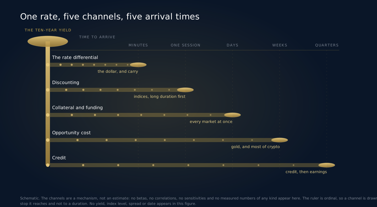
Discounting. Covered above. Inside one index it hits the long-duration constituents hardest, which is how an index falls while half its members sit still.
The rate differential. Capital compares the yield here against the yield there. Fastest channel by a distance, because it needs no revaluation, only a transfer of money.
Credit. Corporate borrowing cost is the base rate plus a spread, and both legs move. It lands on refinancing schedules rather than this quarter's earnings, so it arrives late and then all at once.
Collateral and funding. Government bonds are the collateral the system runs on. When their volatility rises, haircuts rise, dealers carry less, and every other market thins out. Direction is irrelevant; only speed counts.
Opportunity cost. For anything that pays nothing, the real risk-free return is the hurdle. Raise the hurdle and the marginal holder leaves.
The dollar leg is fast, and its sign is not stable
Rate differentials reach FX quotes before the headline finishes loading. That speed makes traders overconfident, because the sign of the relationship changes.
When yields rise on stronger growth the currency usually rises with them: foreign capital wants the higher real return and must buy the currency. When yields rise because holders want more compensation for owning that government's paper, the currency falls while the yield climbs. What separates the two is whether credit spreads are widening alongside, and which end of the curve is steepening.
Two regimes, two kinds of impulse
Here is the part that reaches your markup.
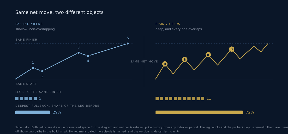
A falling-yield regime puts a permanent bid under valuations. Each quarter the same forecast is worth slightly more, and nobody had to earn it. Corrections stay shallow because the dip buyer is subsidised by arithmetic, and structures look textbook: clean legs, extended thirds, fourth waves that go sideways rather than down.
A rising-yield regime withdraws the subsidy and then charges rent.
| Falling-yield regime | Rising-yield regime | |
|---|---|---|
| The discount rate is | a tailwind reapplied every quarter | a headwind reapplied at every repricing |
| Second and fourth waves | shallow, often flats and triangles | deep, often zigzags that overshoot |
| Overlap | rare, and a real signal when it appears | constant, and the defining feature |
| Stock and bond correlation | negative when growth fear drives the move, so a bond rally cushions the fall | positive when inflation drives the move, so nothing cushions it |
| The rally you keep seeing | a fourth wave inside a trend | an X wave, or a B |
| Long-duration constituents | lead on the way up | lead on the way down |
Watch the correlation row, because it is a sign rather than a level. In a falling-yield world a bad equity session brings a bond rally that offsets part of the loss in a balanced book, so drawdowns feel survivable and get bought. Flip the sign and both legs fall together, which changes how everyone measured on portfolio outcomes behaves.
Why a rising-yield rally keeps looking like a third wave
This is the specific way a good analyst gets hurt.
Counter-trend rallies in a rising-yield regime are fast, broad, and led by the same long-duration names that led the previous bull market. Fast, because positioning is short and short covering has no patience. Broad, because the relief is about the denominator, and the denominator is in everything. Speed plus breadth plus familiar leadership is the signature of a third wave, so that is what gets written on the chart.
Then the rate resumes and the rally hands it all back. It was an X wave or a B, and the tell was there throughout: it overlapped the prior leg, and the rate never confirmed.
Two disciplines follow. Violence does not upgrade a three into a five, because the overlap rule has no opinion on speed. And require the driver to confirm: if your count says a new impulse has begun and the yield has done nothing, you are looking at positioning rather than repricing.
Before you carry a count across a regime change
Counts do not become wrong at a regime boundary. They become miscalibrated, which is harder to spot.
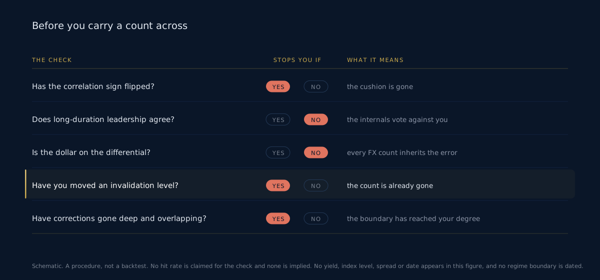
Has the sign of the stock and bond relationship changed? The cheapest check and the most informative. A flip from negative to positive says the cushion under equity drawdowns has gone, so expect corrections to deepen before the structure shows it.
Is long-duration leadership pointing where your count points? Those constituents move first and furthest in both directions. If they lead downward while your count calls for a fifth wave up, the internals are voting against you.
Is the dollar answering the differential or the credit story? Get this wrong and every FX count inherits the error.
Have you moved an invalidation level? If yes, and the reason involved the word rates, the count is gone and you are negotiating with it.
Have the corrections changed character? Shallow and non-overlapping turning deep and overlapping is the structural version of the boundary. It confirms rather than warns.
Where this fails
The ten-year is a price, set in the same auction as everything else. It is not upstream of markets in any causal sense. What you are watching is a common factor reaching different assets at different speeds, which is useful and much less than a forecast.
Three further limits. The level of the yield, the change in it and the volatility of it are separate variables, and most of the damage comes from the third while everyone watches the first. Nominal and real move apart, and a rise driven by inflation expectations does the opposite of one driven by real rates. And the regime label is only unambiguous well after the boundary, so anybody waiting for confirmation pays for the first leg of the new regime with the framework of the old.
Quick facts
- No measured yield, index level, spread or date appears here. Those need the measured data series, and the discounting arithmetic uses a hypothetical 4% starting rate.
- On that assumption, 100 basis points removes 0.95% from a cash flow due in a year and 24.96% from one due in thirty years.
- Two businesses producing the same 1,000 of undiscounted cash lose 4.8% and 21.4%, depending only on when it arrives.
- A perpetuity growing at 1% loses 25% on a move from 4% to 5%, and 33.3% from a two-point starting spread.
- The regime tell is the sign of the stock and bond correlation, not the level of the rate.
- The rate differential reaches FX in minutes; the earnings channel takes quarters.
Frequently asked questions
Does a rising yield mean indices have to fall? No. The discount rate is one term and the cash flow forecast is the other, and a rise driven by stronger growth can lift the numerator faster. The reliable claim is narrower: a rising rate reprices long-duration exposure downward relative to short-duration exposure, whatever the index does.
Why the ten-year rather than the policy rate? The policy rate is a decision; the ten-year is a market. It already contains the expected path of policy plus the compensation demanded for holding duration, and most private borrowing prices off it.
Is this a reason to stop counting waves on indices? The opposite. The regime tells you which corrective forms to expect and how deep, which makes a count easier to hold and to size. It cannot give you a level.
How do I separate a real regime change from a big move inside the existing one? Not from the rate. Use the correlation sign, whether long-duration leadership has flipped, and whether corrections have gone from shallow to deep. Two of the three together is a boundary. One alone is noise.
Does any of this apply to crypto? Through opportunity cost and through funding, yes. There are no cash flows to discount, so the mechanism is the hurdle rate and the supply of borrowed money. A rising real yield does to crypto what it does to profitless growth equity, which is a statement about the buyer, not the technology.
Why not wait for the data file and quote real numbers? The numbers are the illustration; the mechanism is the argument. A yield quoted from memory is a fabricated number wearing a real one's authority. When the file arrives, the history goes in as figure four and nothing above it changes.
THE RATE SETS THE TEMPO. THE COUNT SETS THE SHAPE. EW Strategy publishes daily Elliott Wave analysis across 27 instruments on H4, Daily and Weekly. Annotated PDF reports on the index and dollar complex, EWS Helix on WhatsApp for the sessions where the rate moves first and the chart follows, and the sizing calculators.
Further reading
Frequently asked questions
What is Elliott Wave analysis?+
Elliott Wave analysis is a form of technical analysis based on the theory that financial markets move in predictable wave patterns reflecting crowd psychology. Markets advance in five-wave impulse patterns and correct in three-wave patterns.
How accurate is Elliott Wave analysis?+
Accuracy depends on the analyst's skill, the instrument, and how the result is measured. At EW Strategy, every published call carries a direction, target levels and an invalidation level stated in advance, and every outcome is recorded against them. We are rebuilding that record from the raw archive under a measurement rule published before any figure, and we would rather show nothing than a headline number we cannot defend.
Can Elliott Wave analysis be used for day trading?+
Yes. Elliott Wave patterns appear at all timeframes, from 1-minute charts to monthly charts. Day traders typically focus on sub-minuette and minuette degree waves for intraday setups.
Elliott Wave analyst with 15+ years of experience. Covers 27 instruments daily across Forex, Commodities, Indices and Crypto. Founder of Artavest Oy, Helsinki.